M4S News
UI/UX design
m4snews.com
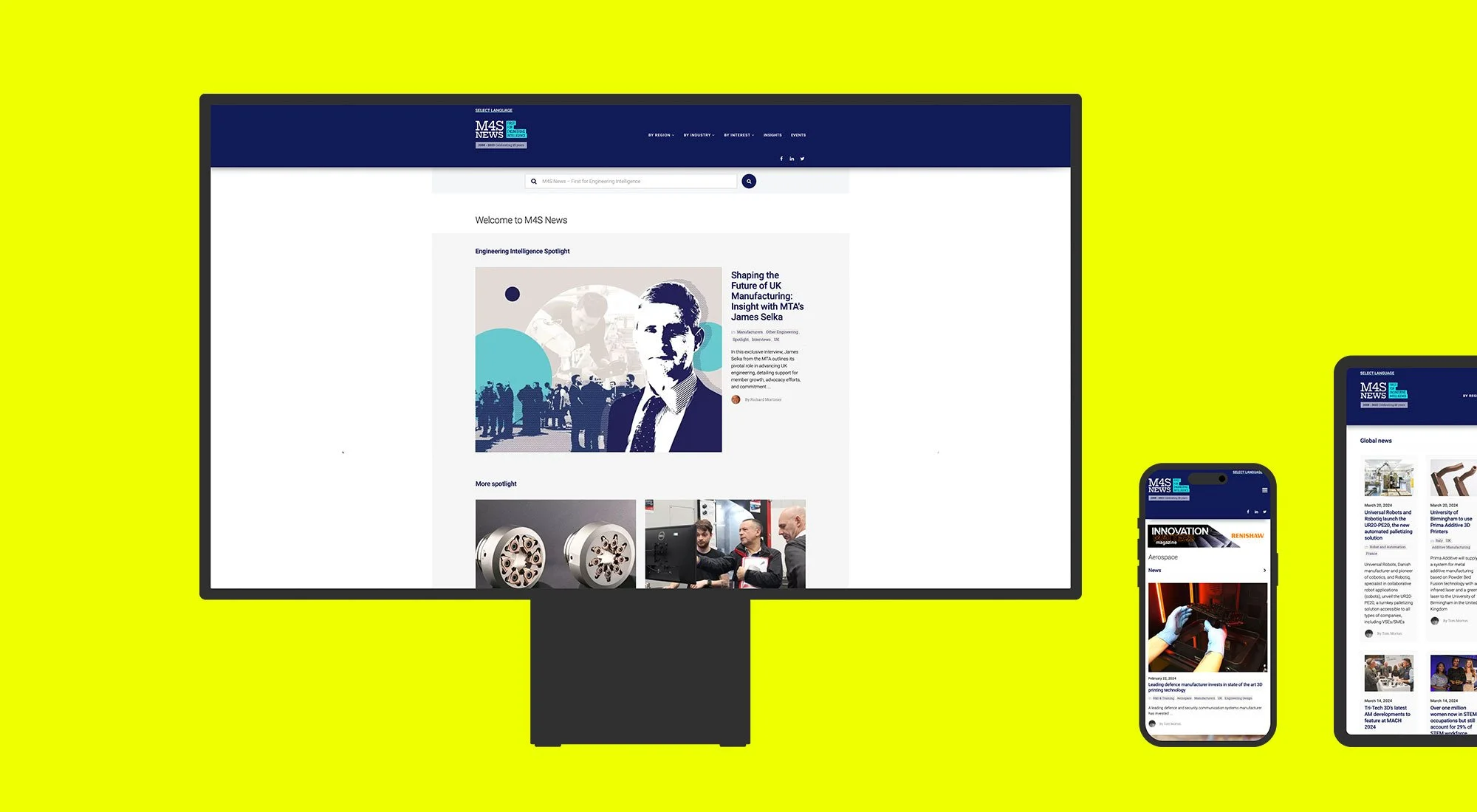
M4S News had been around for years, but the platform was starting to hold it back.
The site felt dated, difficult to navigate and out of step with how people now search for and consume engineering content. At the same time, the wider brand across social, email and sales materials lacked consistency. It all worked, just not together.
The focus was to bring everything into line and make the experience clearer and easier to use. A new platform was already in place, so the work centred on shaping the UI, refining the user journey and making sure the structure could support the volume and depth of content without becoming overwhelming.
Alongside the website, the visual identity was updated and rolled out across social templates, email newsletters and sales tools. The aim was consistency, not reinvention. Something that felt more current, more professional and easier to maintain day to day.
The result is a platform that feels more considered and much easier to navigate. It supports the way people actually use the site, while giving M4S a more consistent and scalable digital presence to build on.