JB Skrub
UI/UX reimagined
jbskrub.com
JB Skrub had a strong idea and a very specific audience.
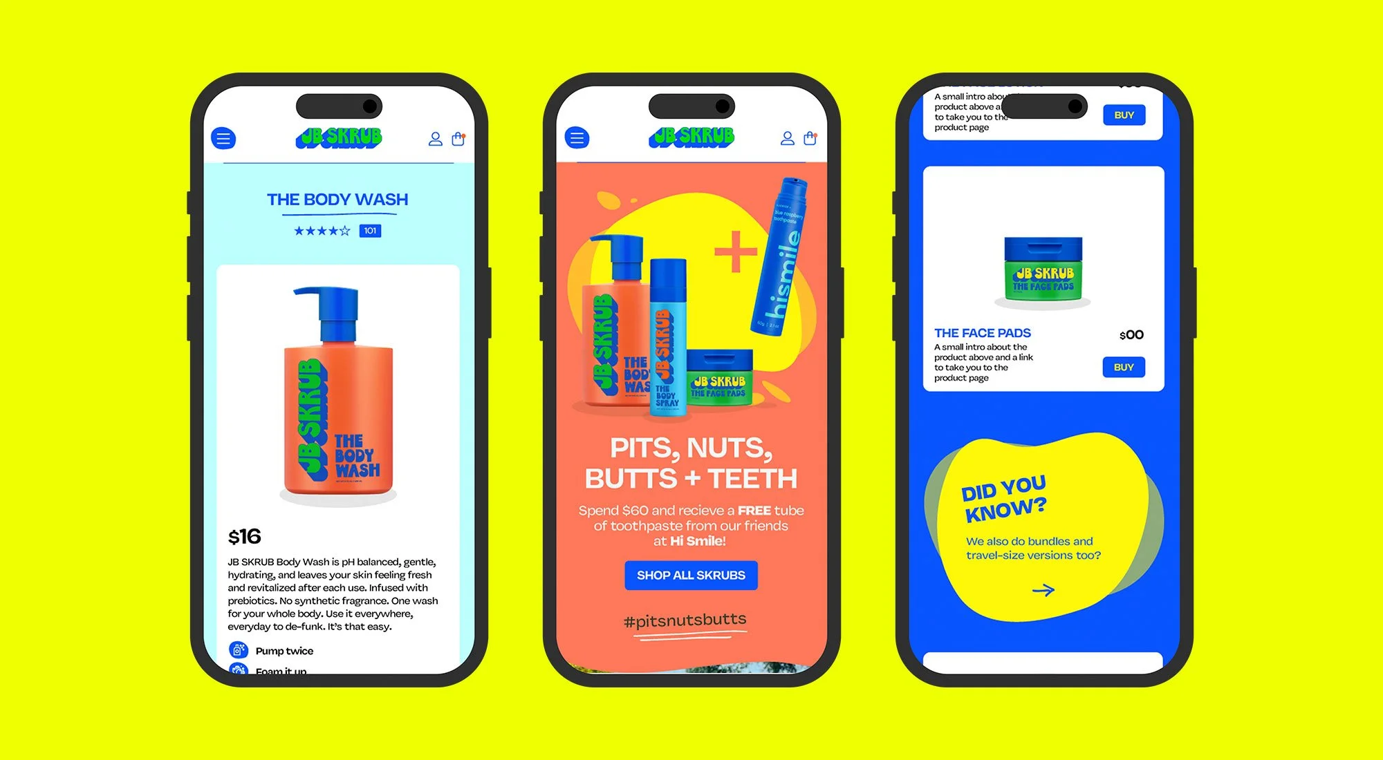
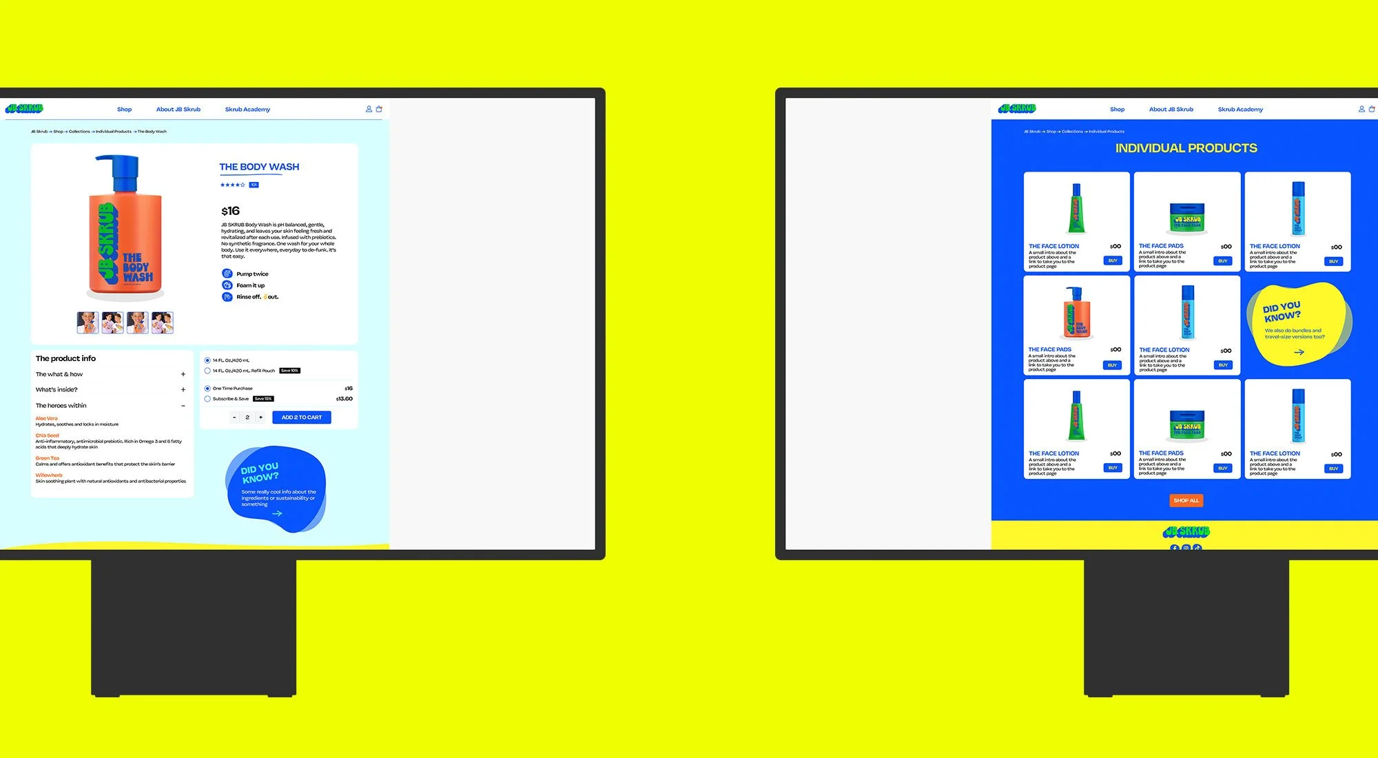
Founded by Julie Bowen and Jill Biren, the brand was created for tween boys who were starting to care about skincare, but didn’t want anything too childish, too clinical or too grown up. The products were already carefully developed and the brand had a bold visual style, but the website needed to work harder for both young customers and the parents often buying for them.
The challenge was to make better use of the existing brand assets without stretching them too far. The colour palette, typefaces and photography all had personality, so the site needed to bring those elements together in a way that felt more confident, more engaging and easier to use.
The redesign focused on a clearer digital experience, with stronger product storytelling, more playful use of colour and interactive elements that helped guide people through the range. It needed to feel fun enough for tweens, but clear and reassuring enough for parents.
The result is a website that feels more connected to the brand and far easier to navigate. It keeps the youthful energy of JB Skrub, while making the shopping experience clearer, more useful and more likely to turn interest into action.