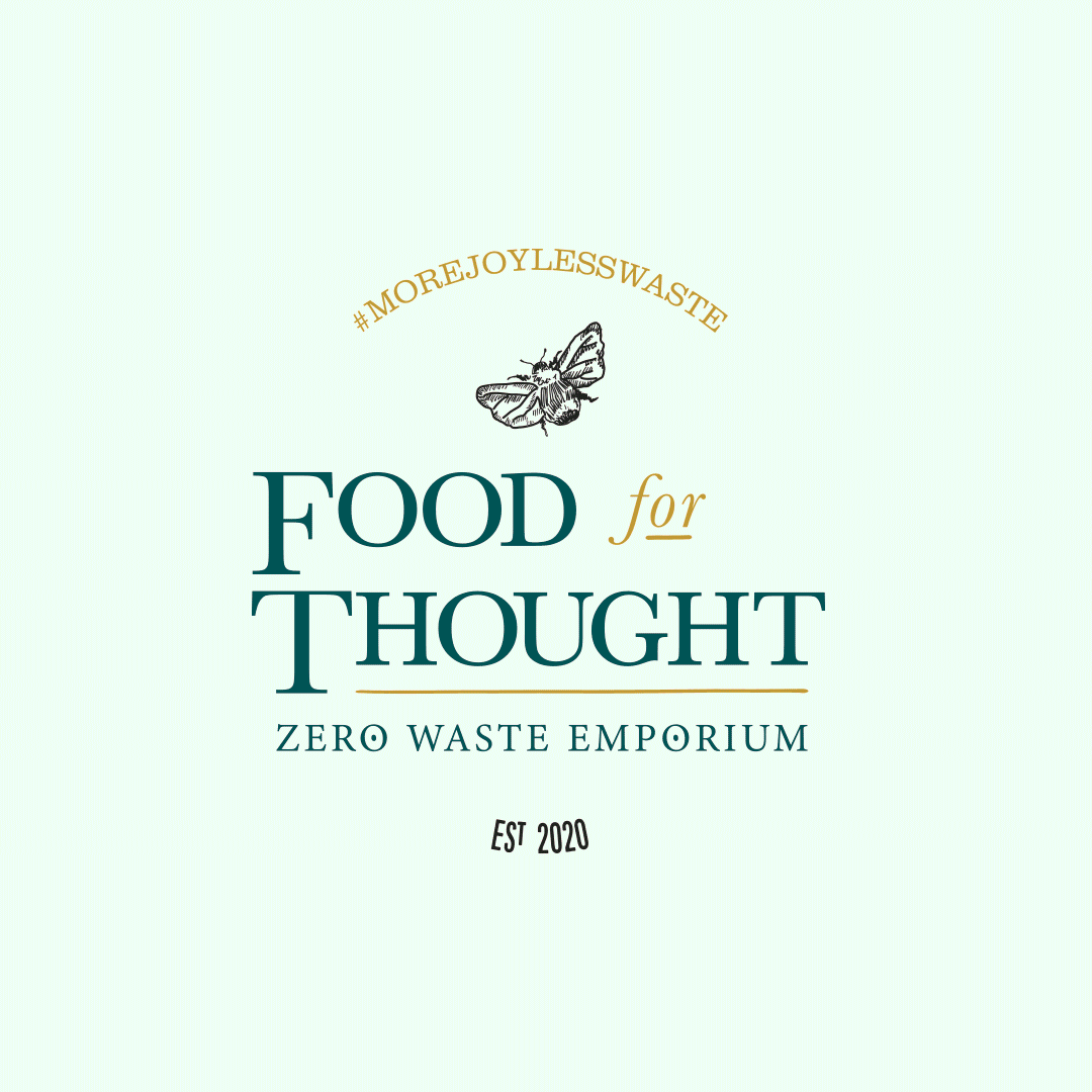
Food for Thought.
Rebrand
Food for Thought had built a loyal following in store, but the brand needed to work harder as they moved online.
The shop is built on a simple idea. Reduce waste, cut out unnecessary chemicals and make everyday products easier to refill. But the existing identity didn’t quite capture the personality behind it or make the process feel as easy and inviting as it is in person.
Time was spent in the shop with Kerry and Alice, understanding how it works day to day and what customers respond to. The aim was to reflect that energy in the brand. Something more playful, more confident and easier to connect with, without losing the purpose behind it.
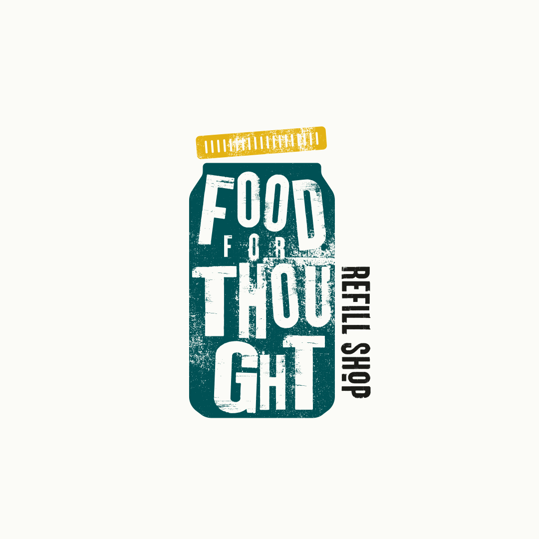
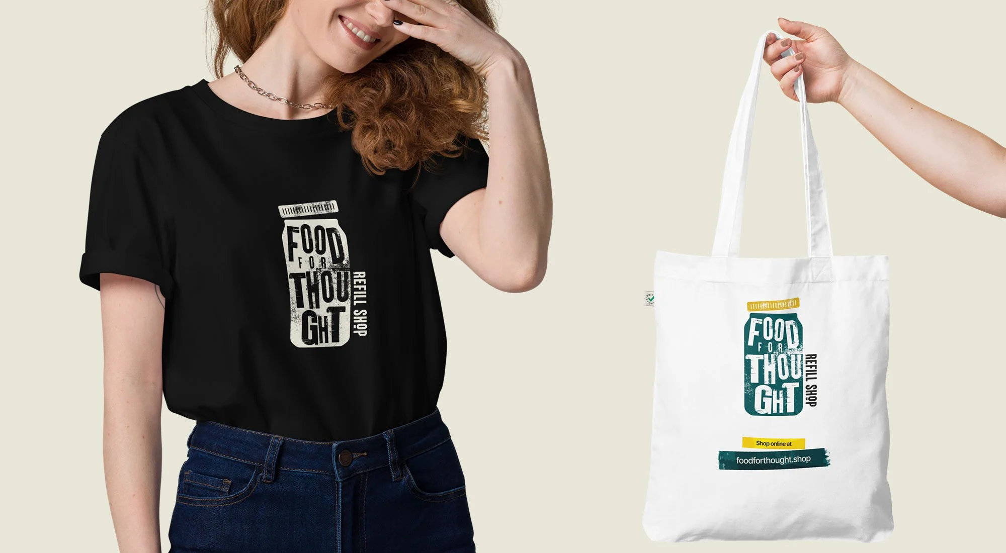
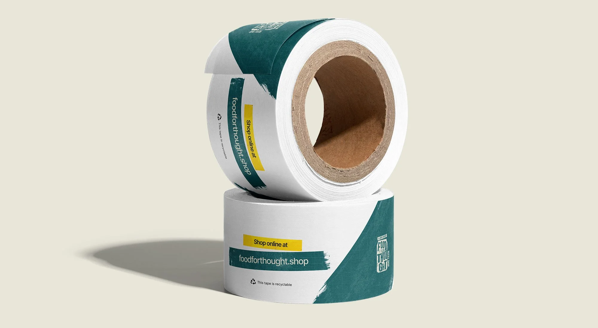
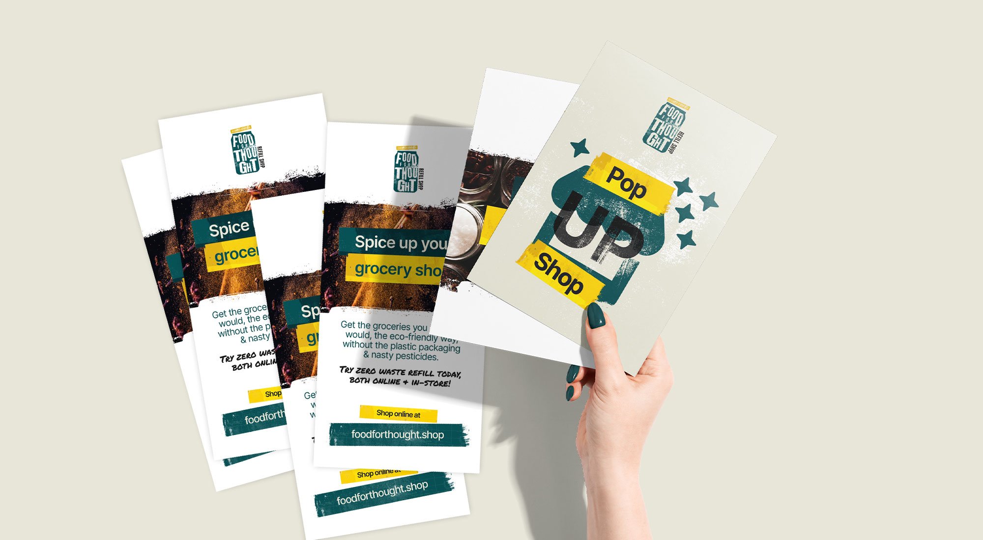
The new identity brings that to life. A bold brand mark, expressive colour and a set of graphic assets that reflect the refill process and the people behind it. Everything was designed to work across the shop and online, with a simple asset library and templates to keep things consistent.
The result is a brand that feels more like Food for Thought. More open, more engaging and better set up to grow beyond the shop, while staying true to what made it work in the first place.